Analyzing Public Transport Volume on Cairo's Road Network
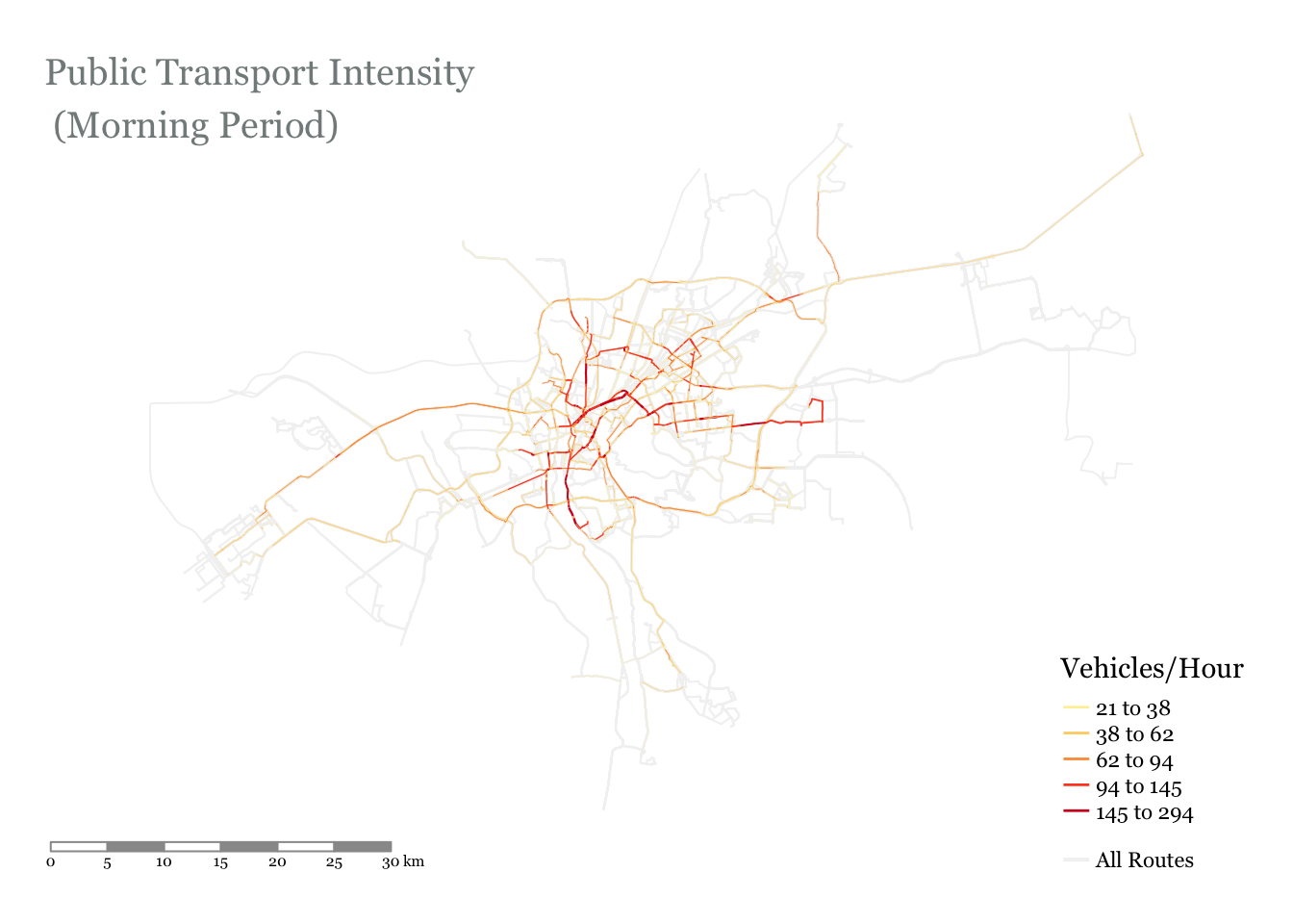
We use Cairo as a case study. Even though Cairo has a metro network with 3 lines, this exercise is limited to surface vehicles only (buses). The image below is the end product that we are trying to get to: a calculation of the number of public transport vehicles traversing each road segment in the capital
Now let's dive into it
library(tidyverse)
# working with (vector) spatial data
library(sf)
library(lwgeom)
# working with gtfs data
library(tidytransit)
# figures / maps / tables
library(ggtext)
library(tmap)
library(kableExtra)
# network analysis - merging nodes and edges
library(sfnetworks)
library(dbscan)
library(tidygraph)
gtfs_as_sf() which converts the stops (in the stops file) and trips (in the shapes file) to sf format.# ------------------------------ Define Variables / Paths ------------------------------ #
GTFS_path <- "../../../../../projects/24-gcr_gtfs_google/GTFS/gcr_feed_king_long_4.3/gtfs.zip"
# ------------------------------ Read in the data ------------------------------ #
# read_gtfs() reads in the gtfs file as a bunch of tibbles (1 for each txt file). gtfs_as_sf() converts 'stops()' to point geometry and
# converts 'shapes' to a linestring geometry
gtfs <- read_gtfs(path = GTFS_path) %>%
gtfs_as_sf()
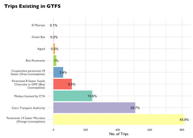
Number of Trips per Agency
There are a number of agencies operating in Greater Cairo. Let's do a quick plot to see their respective contributions to the overall public transport network
# ----- Prepare the data

# --- agency names. We will use normal agency names which are more familiar to people
agency_names <- gtfs$agency %>% select(agency_id, agency_name)


# let's add the agency_id to the trips data so that we can get summary stats per agency. As an intermediate step, we will remove duplicate trips. Trips are duplicated to account for different time intervals, but we still don't have headway disaggregated by time interval, so this duplication is unnecessary for our purposes
trips <- gtfs$trips %>%
  # -- remove duplicate trips by filtering by unique shape_id
  distinct(shape_id, .keep_all = TRUE) %>%
  left_join(gtfs$routes, by = "route_id") %>%
  # add agency name column
  left_join(agency_names, by = "agency_id")

# ----- Plot the data

# assign a color (hex code) to each mode
cols <- c(`Minibus licensed by CTA` = "#8dd3c7",
          `Paratransit 14 Seater Microbus (Orange Licenseplates)` = "#ffffb3",
          `Cairo Transport Authority` = "#bebada",
          `Paratransit 8 Seater Suzuki Chevrolet or DMF (Blue Licenseplates)` = "#fb8072",
          `Cooperative paratransit 29 Seater (Grey Licenseplates)` = "#80b1d3",
          `Agyad` = "#fdb462",
          `Box Paratransit` = "#b3de69",
          `Green Bus` = "#fccde5",
          `El Masreya` = "#d9d9d9")


trips %>%
  group_by(agency_name) %>%
  summarize(no_trips = n()) %>%
  # reorder rows for plotting https://www.r-graph-gallery.com/267-reorder-a-variable-in-ggplot2.html
  mutate(agency_name = fct_reorder(agency_name, desc(no_trips)),
         # get perc rounded to 1 decimal place. Add % sign
         perc = stringr::str_c(round((no_trips / sum(no_trips) * 100), 1), "%")) %>%
  # -- plot
  ggplot(aes(x = agency_name, y = no_trips, fill= agency_name)) +
  geom_bar(stat="identity") +
  geom_text(aes(label=perc), position=position_dodge(width=0.9), size=3) +
  # wrap long text labels on multiple lines
  scale_x_discrete(labels = function(x) stringr::str_wrap(x, width = 30)) +
  # set colors
  scale_fill_manual(values = cols) +
  coord_flip() +
  labs(title="<b>Trips Existing in GTFS</b><br>",
    x = "",
    y = "No. of Trips") +
  theme_minimal() +
  theme(legend.position = "none",
        plot.title.position = "plot",
        text=element_text(size=10,  family="Gill Sans"),
        plot.title = element_textbox_simple(
         # fill = "#ECEFF4", # cornsilk
          size = 13,
          lineheight = 1,
          padding = margin(5.5, 5.5, 5.5, 5.5),
          margin = margin(0, 0, 5.5, 0)))
Trip Frequency Per Route
In order to estimate the number of public transport vehicles on the road network, we need to know the estimated headway of each route (i.e. the estimated time between consecutive departures on a route). We use the frequencies table in the gtfs feed to determine the headway on each route.For simplicity, we will focus on the three most popular modes: Microbuses, CTA Buses, and Minubuses licensed by the CTA# We already did this calculation, but we had selected unique shape_ids. We don't want to do this now,
# so we repeat
trip_shapes_freq <- gtfs$trips %>%
left_join(gtfs$routes, by = "route_id") %>%
#filter(agency_id != "BOX") %>%
left_join(agency_names, by = "agency_id") %>%
left_join(gtfs$shapes, by = "shape_id") %>%
# convert from df to sf
st_as_sf() %>%
# get trip length
mutate(trip_length_km = as.integer(st_length(.) / 1000))
# add frequency of each trip from the 'frequencies' file in the GTFS
trip_shapes_freq <- trip_shapes_freq %>%
# remove agencies that we don't care about
dplyr::filter(agency_id %in% c('CTA','CTA_M', 'P_O_14')) %>%
left_join(gtfs$frequencies, by = "trip_id") %>%
# get headway in minutes as it is more intuitive
mutate(headway_mins = round(headway_secs/60, 0))
# table
trip_shapes_freq %>%
st_drop_geometry() %>%
head(100) %>%
select(route_long_name, trip_headsign, agency_name, trip_length_km, start_time, headway_mins) %>%
kbl() %>%
kable_styling(bootstrap_options = c("striped", "hover", "condensed")) %>%
scroll_box(width = "100%", height = "200px")
| route_long_name | trip_headsign | agency_name | trip_length_km | start_time | headway_mins |
|---|---|---|---|---|---|
| Mazallat Station - 1st Settlement Station (New Cairo) | 1st Settlement Station (New Cairo) | Minibus licensed by CTA | 32 | 06:00:00 | 17 |
| Mazallat Station - 1st Settlement Station (New Cairo) | 1st Settlement Station (New Cairo) | Minibus licensed by CTA | 32 | 10:00:00 | 17 |
| Mazallat Station - 1st Settlement Station (New Cairo) | 1st Settlement Station (New Cairo) | Minibus licensed by CTA | 32 | 15:00:00 | 12 |
| Mazallat Station - 1st Settlement Station (New Cairo) | 1st Settlement Station (New Cairo) | Minibus licensed by CTA | 32 | 19:00:00 | 30 |
| Mazallat Station - 1st Settlement Station (New Cairo) | Mazallat Station | Minibus licensed by CTA | 30 | 06:00:00 | 17 |
The table above shows a sample of all the routes in the GTFS feed. At TfC, we create GTFS feeds that model routes at different times of day (morning peak, off-peak, and evening peak). This feed has 4 intervals:
06:00 - 10:00 (Morning Peak)
10:00 - 15:00 (Morning Off-Peak)
15:00 - 19:00 (Evening Peak)
19:00 - 23:00 (Evening Off-Peak)
Let's see a zoomed out plot of headways of different modes during different time intervals
# plot distribution of trip frequencies per agency
trip_shapes_freq %>%
  filter(!is.na(start_time)) %>%
  ggplot(aes(x = headway_mins, y = agency_name, fill = agency_name)) +
  geom_violin() +
  #geom_violin(draw_quantiles = c(0.25, 0.5, 0.75))  +
  theme(legend.position="none",
        plot.title = element_text(size=11)) +
  labs(title="Headway Distribution Per Agency",
       x ="Headway (minutes)", y = "No. of Trips") +
  # force the x axis to start at 0
  scale_x_continuous(expand = c(0, 0), limits = c(0, NA))  +
  # wrap long text labels on multiple lines
  scale_y_discrete(labels = function(x) stringr::str_wrap(x, width = 20)) +
  geom_boxplot(width=0.1, outlier.shape = NA) +
  scale_fill_manual(values = cols) +
  theme_minimal() +
  theme(legend.position = "none",
        text=element_text(size=12,  family="Gill Sans")) +
  # facet wrap allows us to split the data (by a specific variable) into groups, and create one plot per group
  facet_wrap(~ as.character(start_time), ncol=2)
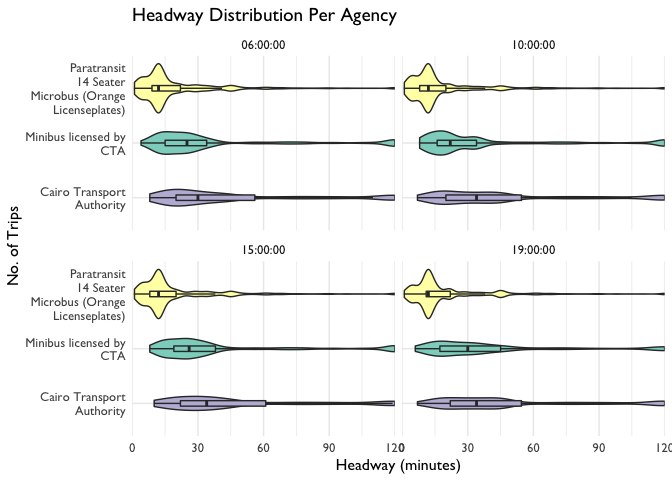
The plot above is a violin plot of route headways by mode. It includes a box plot (median and interquartile range), with the addition of a probability density mirrored on each side of the horizontal line. At first glance, it is difficult to identify the differences in operation for each mode across the day, but if we look closely we can make some observations.
Microbuses offer the most frequent services, and this appears to be consistent throughout the day
CTA buses tend to operate more regulary in the early morning (average headway around 25 minutes), and after 10:00am the buses are less frequent (with an average headway of 35 minutes).
CTA Minibus services are more consistent throughout the day, but become less frequent after 7pm. This is apparent in the average headway, and also in the shape of the violin plot, which flattens and shifts to the right in the last plot
Of course, these are just some rough observations made from aggregate data. We could dive deeper to look at headway variations on a route level, but that isn't the focus of this blogpost.
Now we have the headway (in minutes) for each route at 4 different times of day - 06:00 - 10:00 - 10:00 - 15:00 - 15:00 - 19:00 - 19:00 - 23:00
We will focus only on the morning peak (06:00 - 10:00)
Network Analysis
To estimate the total number of vehicles on each road segment, the first step is to get the number of vehicles on each route. This is a straightforward calculation:
# Add a column so that each Service is One Trip
trip_shapes_network <- trip_shapes_freq %>%
  # start time column is class <time>
  filter(as.character(start_time) == "06:00:00") %>%
  mutate(`No. of Trips` = 1,
         `Vehicles/Hour` = round(60 / headway_mins))
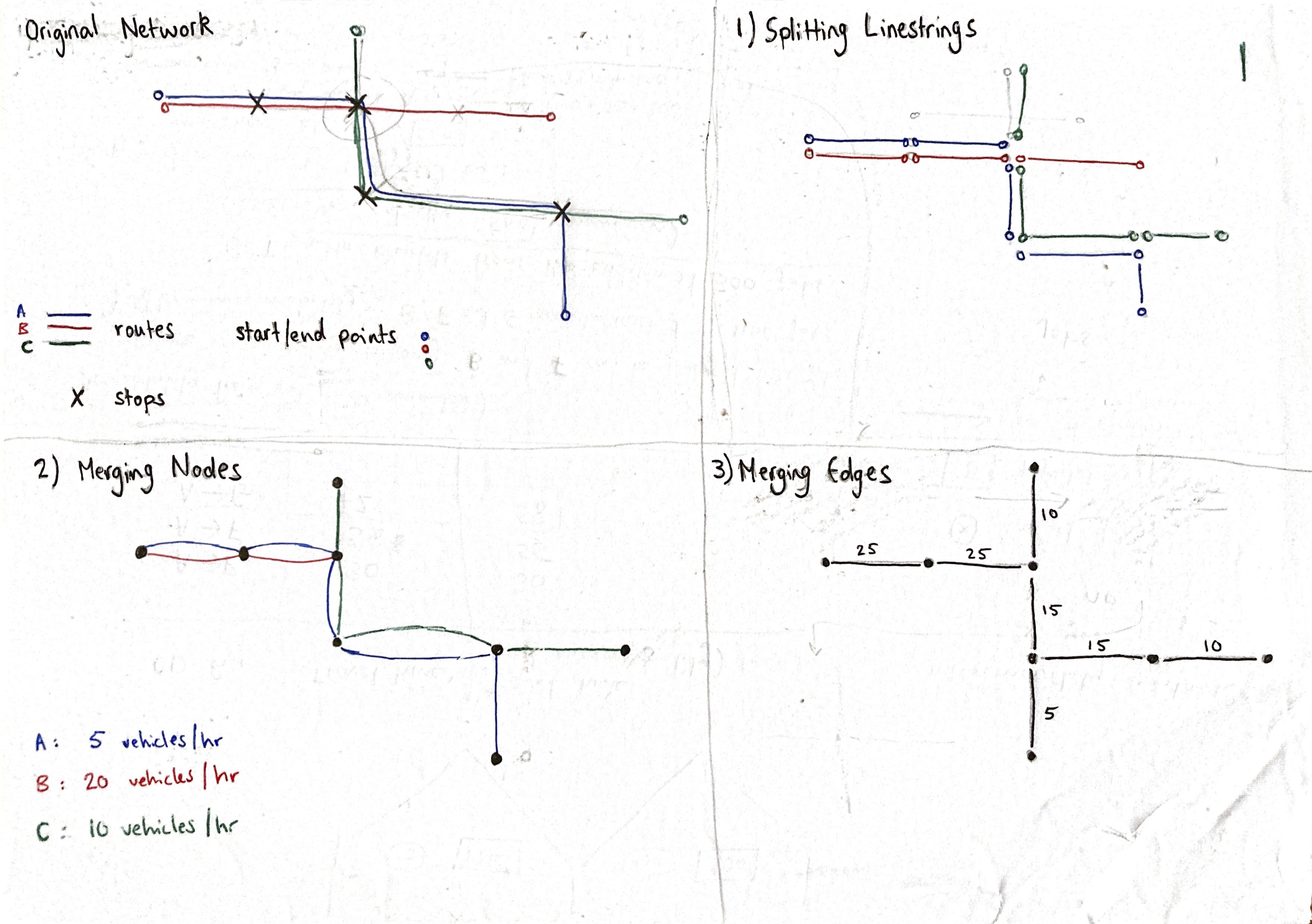
Splitting Linestrings
Each trip is made up of one linestring, with only two nodes (a start and end node). However, each trip has a unique itinerary, and to calculate the number of vehicles on each road segment, we must aggregate the trips at the road segment level. The process is shown in the figure above.
The first step is to split up the trip geometry.
- Data to be segmented: trip linestring geometry
- Data to segment by: stop network
We do this using the following logic:
Buffer the stops
Split linestrings by stops
Remove very small segments. Length < specified filtering length
# --- function to segment the network

# filtering_length: used to determine the minimum segment length that will be in the returned data
# I calibrate it using trial and error (visualizing on qgis and seeing which segments were removed)
split_trips_at_stops = function(trips, stops, buffer_m, filtering_length = 0){
  # --- a. create buffer around stops because they do not intersect exactly with linestrings
   stops_buffer <- stops %>% st_transform(3857) %>% st_buffer(buffer_m) %>% st_transform(4326)
   # --- b. split trips at stops
   trip_segments <- st_split(trips, stops_buffer) %>%
     st_collection_extract("LINESTRING") %>%
     st_as_sf() %>%
     # we add an id column so we can differentiate between the different segments of each shape_id
     group_by(shape_id) %>% mutate(id = row_number()) %>% ungroup()
   # --- Remove small linestrings that are inside stop buffer. Do this by calculating linestring length and
   # then removing linestrings that are shorter than 2*stop_buffer (i.e stop buffer diameter)
   trip_segments <- trip_segments %>% mutate(length_m = as.integer(st_length(.))) %>%
     filter(length_m > filtering_length)

   return(trip_segments)
}

# apply the function
trips_segmented <- split_trips_at_stops(
  trips = trip_shapes_network,
  stops = gtfs$stops,
  buffer_m = 150,
  filtering_length = 20)
Merging Nodes
The first step is to convert the sf feature to a network. The network is made up of two spatial dataframes: One for edges, and one for nodes.# let's work with the spatial dataframe we've created
layer <- trips_segmented
# convert to sfnetwork
layer_net <- layer %>%
st_transform(3857) %>% # I want metric crs for grouping nodes based on distance
as_sfnetwork(., directed = FALSE)
layer_net
## # A sfnetwork with 37820 nodes and 137728 edges
## #
## # CRS:  EPSG:3857
## #
## # An undirected multigraph with 8507 components with spatially explicit edges
## #
## # Node Data:     37,820 × 1 (active)
## # Geometry type: POINT
## # Dimension:     XY
## # Bounding box:  xmin: 3439284 ymin: 3470773 xmax: 3534934 ymax: 3541686
##            geometry
##         <POINT [m]>
## 1 (3478369 3517048)
## 2 (3478365 3517009)
## 3 (3478353 3516980)
## 4 (3478327 3516950)
## 5 (3478293 3516918)
## 6 (3478284 3516909)
## # … with 37,814 more rows
## #
## # Edge Data:     137,728 × 23
## # Geometry type: LINESTRING
## # Dimension:     XY
## # Bounding box:  xmin: 3439039 ymin: 3470773 xmax: 3534994 ymax: 3541784
##    from    to route_id service_id trip_headsign direction_id shape_id trip_id
##   <int> <int> <chr>    <chr>      <chr>                <int> <chr>    <chr>
## 1     1     2 -6XpwB9… Ground_Da… 1st Settleme…            1 _gyb4P-… _gyb4P…
## 2     2     3 -6XpwB9… Ground_Da… 1st Settleme…            1 _gyb4P-… _gyb4P…
## 3     3     4 -6XpwB9… Ground_Da… 1st Settleme…            1 _gyb4P-… _gyb4P…
## # … with 137,725 more rows, and 15 more variables: route_long_name <chr>,
## #   route_short_name <chr>, agency_id <chr>, route_type <int>,
## #   agency_name <chr>, trip_length_km <int>, start_time <time>,
## #   end_time <time>, headway_secs <int>, headway_mins <dbl>, `No. of
## #   Trips` <dbl>, `Vehicles/Hour` <dbl>, geometry <LINESTRING [m]>, id <int>,
## #   length_m <int>
  # --- 2. group nodes based on proximity
   # -- a. Retrieve the coordinates of the nodes.
  node_coords = layer_net %>%
    activate("nodes") %>%
    st_coordinates()
   # -- b. Cluster the nodes with the DBSCAN spatial clustering algorithm.
  # We set eps = x such that:
  # Nodes within a distance of x meters from each other will be in the same cluster.
  # We set minPts = 1 such that:
  # A node is assigned a cluster even if it is the only member of that cluster.
  clusters = dbscan(node_coords, eps = 100, minPts = 1)$cluster
  # Add the cluster information to the nodes of the network.
  clustered =  layer_net %>%
    activate("nodes") %>%
    mutate(cls = clusters)
   # -- c. contract: merge nodes together based on clustering results
  layer_cont = tidygraph::convert(
    clustered,
    to_spatial_contracted,
    cls,
    # simplify - FALSE so that we keep multiple edges. Multiple edges are edges that have the      same start and end nodes.
    # All edges that have the same from and to node will then be grouped in the next step
    simplify = FALSE
  )
Merging Edges
At this point we have used a clustering algorithm to merge nodes that are close to each other. Now we have many edges with the same start and end nodes.
The next step is to merge all multiple edges (edges that have the same node endpoints). We merge them and sum the value for vehicles/hour. Documentation for this morpher is found here
# replace NA values with 0 so that summation works
  layer_cont <- layer_cont %>%
    activate("edges") %>%
    mutate(`Vehicles/Hour` = replace_na(`Vehicles/Hour`, 0))

  # --- 3. merge multiple edges (edges that have the same end nodes)

  # combine edges that have the same origin and destination node.
  # This allows us to merge directions (as well as multiple lanes e.g. having flow
  # on 1 segment on the ring road instead of 4 lanes)

  # Simplify the network with to_spatial_simple.
  layer_simp = tidygraph::convert(
    layer_cont,
    to_spatial_simple,
    # `Vehicles/Hour` will be summed, all other attributes we will take the first row in the group
    summarise_attributes = list(`Vehicles/Hour` = "sum", "first"))

  # --- 4. Convert to sf in order to save
  layer_simp <- layer_simp %>%
    activate("edges") %>%
    st_as_sf() %>% st_transform(4326) %>%
    select(`Vehicles/Hour`)
Wrap the merging logic (3.2 - 3.3) inside a function
# ----------------------- Network Analysis - Merging Overlapping Edges ----------------------- #

# this function takes a layer and then does the following
# --- 1. convert to sfnetwork
# --- 2. group nodes based on proximity (using "radius" argument provided)
# --- 3. merge multiple edges (edges that have the same end nodes) and sum the flow of the merged edges
# --- 4. Convert back to sf in order to save

simplify_graph = function(layer, radius){
  # --- 1. convert to sfnetwork
  layer_net <- layer %>%
    st_transform(3857) %>%  # I want metric crs for grouping nodes based on distance
    as_sfnetwork(., directed = FALSE)

  # --- 2. group nodes based on proximity
   # -- a. Retrieve the coordinates of the nodes.
  node_coords = layer_net %>%
    activate("nodes") %>%
    st_coordinates()
   # -- b. Cluster the nodes with the DBSCAN spatial clustering algorithm.
  # We set eps = x such that:
  # Nodes within a distance of x meters from each other will be in the same cluster.
  # We set minPts = 1 such that:
  # A node is assigned a cluster even if it is the only member of that cluster.
  clusters = dbscan(node_coords, eps = radius, minPts = 1)$cluster
  # Add the cluster information to the nodes of the network.
  clustered =  layer_net %>%
    activate("nodes") %>%
    mutate(cls = clusters)
   # -- c. contract: merge nodes together based on clustering results
  layer_cont = tidygraph::convert(
    clustered,
    to_spatial_contracted,
    cls,
    # simplify - FALSE so that we keep multiple edges.
    # All edges that have the same from and to node will then be grouped in the next step
    simplify = FALSE
  )

  # replace NA values with 0 so that summation works!
  layer_cont <- layer_cont %>%
    activate("edges") %>%
    mutate(`Vehicles/Hour` = replace_na(`Vehicles/Hour`, 0))

  # --- 3. merge multiple edges (edges that have the same end nodes)

  # combine edges that have the same origin and destination node.
  # This allows us to merge directions (as well as multiple lanes e.g. having flow
  # on 1 segment on the ring road instead of 4 lanes)

  # Simplify the network with to_spatial_simple.
  layer_simp = tidygraph::convert(
    layer_cont,
    to_spatial_simple,
    # `Vehicles/Hour` will be summed, all other attributes we will take the first row in the group
    summarise_attributes = list(`Vehicles/Hour` = "sum", "first"))

  # --- 4. Convert to sf in order to save
  layer_simp <- layer_simp %>%
    activate("edges") %>%
    st_as_sf() %>% st_transform(4326) %>%
    select(`Vehicles/Hour`)

  # --- 5. Overline function
  layer_simp <- stplanr::overline2(layer_simp, attrib = "Vehicles/Hour")

  return(layer_simp)
}


# apply function to all trips
trip_shapes_vehicles <- simplify_graph(layer = trip_shapes_network,
                                       radius = 100)
Visualise the Results
We want to focus on the busy roads, so we can filter out some roads with light traffic
# plot the distribution of vehicles per hour

# simple plot
# hist(trip_shapes_vehicles$`Vehicles/Hour`)

# ggplot - slightly
trip_shapes_vehicles %>%
  ggplot( aes(x=`Vehicles/Hour`)) +
  geom_histogram(binwidth = 20, color="white")  +
  labs(title="Public Transport Vehicles on Road Segments",
       y = "No. of Road Segments") +
  theme_minimal()
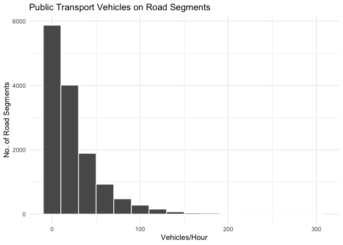
# for visualisation purposes, we remove segments with low values
trip_shapes_vehicles_simp <- trip_shapes_vehicles %>%
  filter(`Vehicles/Hour`> 20)

tmap_mode("plot")
#### Plot with colour proportional to Vehicles/Hour  ####
tm_shape(gtfs$shapes) +
  tm_lines(col = 'gray95') +
tm_shape(trip_shapes_vehicles_simp) +
  tm_lines(title.col = "Vehicles/Hour",
           col = 'Vehicles/Hour',
           lwd = 'Vehicles/Hour',
           style = "jenks",
           scale = 1.8,     #multiply line widths by X
           palette = "YlOrRd",
           #style = "cont",   # to get a continuous gradient and not breaks
           legend.lwd.show = FALSE) +
  tm_layout(title = "Public Transport Intensity - (Morning Period)",
            title.size = 1.2,
            title.color = "azure4",
            #title.position = c("left", "top"),
            inner.margins = c(0.1, 0.1, 0.1, 0.1),    # bottom, left, top, and right margin
            fontfamily = 'Georgia',
            #legend.position = c("left", "bottom"),
            frame = FALSE) +
  tm_scale_bar(color.dark = "gray60", position = c("left", "bottom")) +
  # add legend for all routes (shown in background)
  tm_add_legend(type = "line", labels = 'All Routes', col = 'gray95', lwd = 2) -> p

# show the plot
p
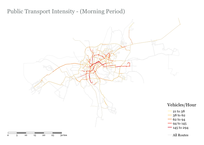
p
We can see that public transport operation correlates well with known congestion hotspots:
South ring road from the Autostrad to New Cairo
6th of October Bridge
Nasr City
- El Nasr Road / Mostafa El Nahas / Ahmed El Zomor
26th of July Corridor
An analysis like this could be useful for looking at route competition, identifying bottlenecks, or informing which road segments could be good candidates for a segregated bus lane. These are just some options, can you think of others?